这篇文章主要为大家详细介绍了Flutter自定义搜索框效果,文中示例代码介绍的非常详细,具有一定的参考价值,感兴趣的小伙伴们可以参考一下
本文实例为大家分享了Flutter自定义搜索框效果的具体代码,供大家参考,具体内容如下
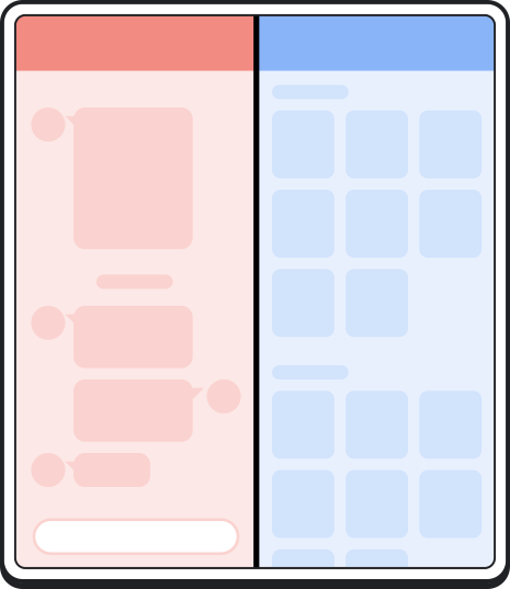
效果

实现方式
import 'package:dio/dio.dart';
import 'package:flutter/material.dart';
import 'package:keduo/base/baseSize.dart';
import 'package:keduo/utils/icon_utils.dart';

class SearchBarWidget extends StatefulWidget {
  final ValueChanged<String> onchangeValue;
  final VoidCallback onEditingComplete;
  const SearchBarWidget({this.onchangeValue, this.onEditingComplete, Key key})
      : super(key: key);

  @override
  SearchBarWidgetState createState() => SearchBarWidgetState();
}

class SearchBarWidgetState extends State<SearchBarWidget> {
  ///编辑控制器
  TextEditingController _controller;

  ///是否显示删除按钮
  bool _hasDeleteIcon = false;

  @override
  void initState() {
    super.initState();
    _controller = TextEditingController();
  }

  Widget buildTextField() {
    //theme设置局部主题
    return TextField(
      controller: _controller,
      textInputAction: TextInputAction.search,
      keyboardType: TextInputType.text,
      maxLines: 1,
      decoration: InputDecoration(
        //输入框decoration属性
        contentPadding:
            const EdgeInsets.symmetric(vertical: 10.0, horizontal: 1.0),
        //设置搜索图片
        prefixIcon: Padding(
          padding: EdgeInsets.only(left: 0.0),
          child: ImageIcon(
            AssetImage(
              IconUtils.getIconPath('ic_edit_search'),
            ),
            color: Colors.black26,
          ),
        ),
        prefixIconConstraints: BoxConstraints(
          //设置搜索图片左对齐
          minWidth: 30,
          minHeight: 25,
        ),
        border: InputBorder.none, //无边框
        hintText: " 请输入商品名",
        hintStyle: new TextStyle(fontSize: BaseSize.sp(14), color: Colors.grey),
        //设置清除按钮
        suffixIcon: Container(
          padding: EdgeInsetsDirectional.only(
            start: 2.0,
            end: _hasDeleteIcon ? 0.0 : 0,
          ),
          child: _hasDeleteIcon
              ? new InkWell(
                  onTap: (() {
                    setState(() {
                      /// 保证在组件build的第一帧时才去触发取消清空内容
                      WidgetsBinding.instance
                          .addPostFrameCallback((_) => _controller.clear());
                      _hasDeleteIcon = false;
                    });
                  }),
                  child: Icon(
                    Icons.cancel,
                    size: 18.0,
                    color: Colors.grey,
                  ),
                )
              : new Text(''),
        ),
      ),
      onChanged: (value) {
        setState(() {
          if (value.isEmpty) {
            _hasDeleteIcon = false;
          } else {
            _hasDeleteIcon = true;
          }
          widget.onchangeValue(_controller.text);
        });
      },
      onEditingComplete: () {
        FocusScope.of(context).requestFocus(FocusNode());
        widget.onEditingComplete();
      },
      style: new TextStyle(fontSize: 14, color: Colors.black),
    );
  }

  @override
  Widget build(BuildContext context) {
    return Container(
      //背景与圆角
      decoration: new BoxDecoration(
        border: Border.all(color: Colors.black12, width: 1.0), //边框
        color: Colors.black12,
        borderRadius:
            new BorderRadius.all(new Radius.circular(BaseSize.dp(18))),
      ),
      alignment: Alignment.center,
      height: BaseSize.dp(36),
      padding: EdgeInsets.fromLTRB(10.0, 0.0, 0.0, 0.0),
      child: buildTextField(),
    );
  }

  @override
  void dispose() {
    super.dispose();
    _controller.dispose();
  }
}
使用
@override
  Widget build(BuildContext context) {
    return Scaffold(
      appBar: AppBar(
        elevation: 0,
        brightness: Brightness.light,
        leading: IconButton(
            icon: Image.asset(IconUtils.getIconPath('fanhui')),
            onPressed: () => Navigator.pop(context)),
        title: SearchBarWidget(
          onchangeValue: (value) {
            print(value);
          },
          onEditingComplete: () {
            print('编辑结束');
          },
        ),
        backgroundColor: Colors.white,
      ),
      body: Text(''),
      backgroundColor: BaseColor.colorFFF5F5F5,
    );
  }
以上就是本文的全部内容,希望对大家的学习有所帮助,也希望大家多多支持编程学习网。
织梦狗教程
本文标题为:Flutter自定义搜索框效果


基础教程推荐


猜你喜欢
- 解决Android Studio突然不显示logcat日志的问题 2023-02-04
- Android中的webview监听每次URL变化实例 2023-01-23
- android studio按钮监听的5种方法实例详解 2023-01-12
- Flutter手势密码的实现示例(附demo) 2023-04-11
- iOS开发教程之XLForm的基本使用方法 2023-05-01
- Flutter绘图组件之CustomPaint使用详解 2023-05-12
- Android多返回栈技术 2023-04-15
- Android开发使用RecyclerView添加点击事件实例详解 2023-06-15
- IOS 播放系统提示音使用总结(AudioToolbox) 2023-03-01
- IOS应用内跳转系统设置相关界面的方法 2022-11-20


